


Responsive web design combines aesthetics and technology, tailor-made to ensure a smooth browsing experience across all platforms. BIT Studios deploys this approach, transforming your digital presence into an intuitive, accessible space that resonates with your target audience, regardless of their device.
Some of Our Responsive Web Design Projects

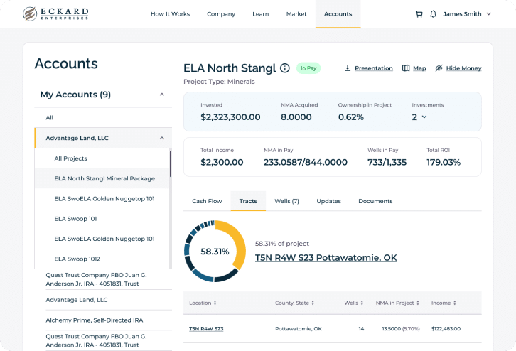
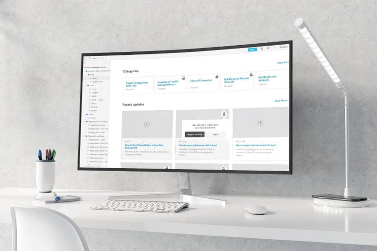
Responsive Design For a Mineral Investments Portal
Our team redefined Eckard Enterprises’ digital landscape with responsive web design services, crafting an intuitive mineral investments portal. The streamlined design enables users to manage their energy assets with remarkable efficiency. Accessible through a mobile app and a web portal, our design prioritized user experience, merging convenience with functionality in an easy-to-use, multi-platform digital environment.

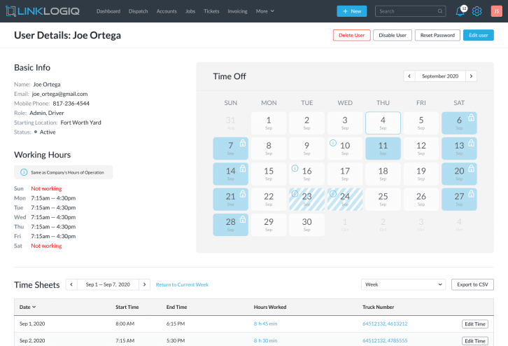
Responsive SaaS Solution For Waste Service Management
BIT Studios collaborated with trailblazing startup, Linklogiq, to deliver a responsive web design for their innovative Cloud-Based SaaS solution in the roll-off dumpster and waste management service industry. The design epitomized operational efficiency and catered to the niche requirements, setting a new standard for peers in the sector.
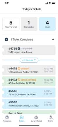
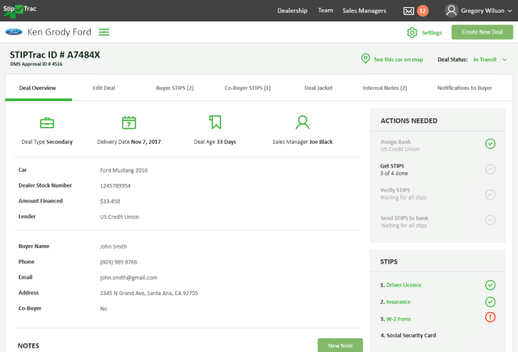
Responsive Design For An Auto Dealer Management Platform
BIT Studios revolutionized StipTrac’s digital presence through our responsive web design services. We crafted a semi-functional prototype utilized by our client for demonstrations and gathering invaluable user feedback. Our work resulted in creating an intuitive client mobile app, a comprehensive auto dealer management portal, and a powerful super admin portal, achieving a seamless, user-centric digital experience across various platforms.

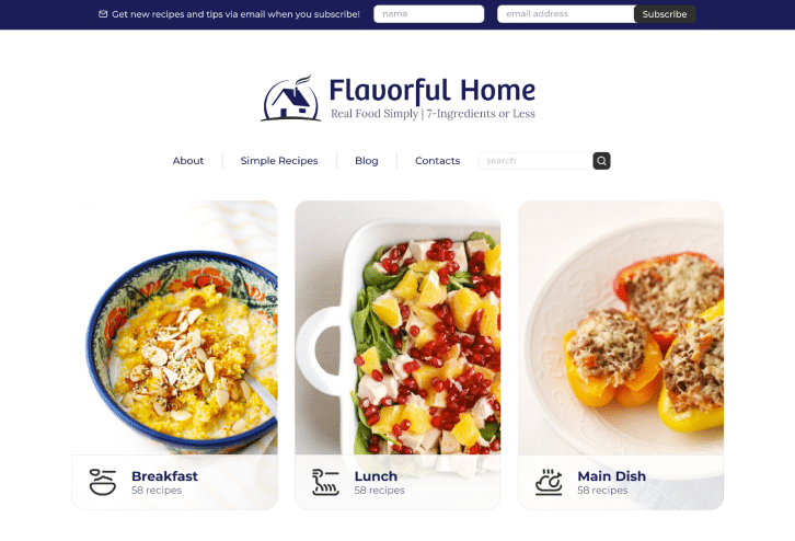
Responsive WordPress Design For a Food Blog
BIT Studios delivered a custom responsive web design for FlavorfulHome’s WordPress site, ensuring an optimal viewing and interaction experience across a range of devices. This tailored approach, moving beyond generic templates, prioritized user-friendliness and adaptability, setting a new benchmark in website design for the client.

BIT Studios Responsive Web Design Services
Dive into BIT Studios’ comprehensive services dedicated to creating an engaging, efficient, and fully responsive web design that elevates your digital presence.

Responsive E-commerce Design
We craft tailored e-commerce platforms, ensuring a seamless shopping experience across all devices.
- Customized product gallery optimized for all screen sizes.
- Seamless checkout process adapted for mobile, tablet, and desktop.
- Mobile-friendly product search and filter features.
- Integration of responsive payment gateways and shopping carts.
- Automated responsiveness testing across multiple devices.

Responsive B2C Website Design
We specialize in designing intuitive B2C websites that adapt to various screen sizes effortlessly.
- Dynamic landing pages that adjust to varied screen sizes.
- Responsive media galleries for showcasing products/services.
- Efficient mobile navigation menus and touch-friendly controls.
- Integration of social media and other third-party plugins.
- Consistent brand appearance across all devices.
Responsive UI Development
Engage with us to get user interfaces that are visually appealing and function perfectly on any device.
- Creation of responsive icons, buttons, and controls.
- Fluid grid layouts that adjust content based on screen dimensions.
- Development of adaptable media elements (images, videos).
- Touch-optimized interfaces for better mobile interactions.
- Periodic testing to ensure consistent UI experience on all devices.
Responsive Web Design Template
Choose us for customizable web design templates that ensure your website looks great on all devices.
- Pre-designed layouts optimized for various industry needs.
- Customizable color schemes and fonts adaptable across devices.
- Plug-and-play modules for quick site assembly.
- Built-in responsive design testing tools.
- Continuous updates to templates to align with current design trends.

Responsive Website Development
Partner with us to build websites that adjust elegantly across multiple devices.
- Fluid layouts with breakpoints for key screen sizes.
- Cross-browser compatibility testing and adjustments.
- Efficient loading times optimized for mobile data connections.
- SEO-friendly architecture with responsive meta tags.
- Integration of responsive content management systems.

Responsive Web App Development
We engineer web apps designed to perform flawlessly on both desktop and mobile platforms.
- Creation of adaptable dashboards and analytics displays.
- Mobile-first functionalities like touch gestures and offline access.
- Integration with native device functionalities (camera, GPS, etc.).
- Web app performance optimization for quick load times.
- Regular updates to ensure compatibility with the latest OS versions.
Why Choose Us As Your UX Design Services Company
 BIT Studios has been creating responsive web designs since 2003
 100+ Enterprise Projects Completed
 4.9 Rating on Clutch
 Trusted by Fortune 500 and Startups
What Our Customers Say


 Thomas CromkrightCEO, CertifID
 Steven DavidsonCEO, Agility Health
 Carol KozlowskiCPIM
 Mark AllenSVP and CIO, Midwest Wireless
 Aaron WittersheimCEO, Straight North
 Conan VenusOwner, Conan Venus And Company
 Edward MaisonneuvePresident, StipTrac
 Nick PiotrowskiMarketing Manager, IKONIX
Awards BIT Studios Received


Trust BIT Studios for responsive web design, ensuring optimal user experience on any device!
Key Advantages of Our User Interface Design Services
As a responsive web design agency, we specialize in enhancing our clients’ digital visibility through effective design strategies. Here’s an insight into our approach to responsive web design at BIT Studios.
Mobile-first Strategy
Prioritizing mobile device compatibility, BIT Studios designs a responsive website with smartphones in mind.
Budgeting
As a responsive web design company, BIT Studios offers detailed, transparent budgets matching project size and complexity.
Realistic Timelines
BIT Studios commits to practical timelines, balancing quick delivery with thorough testing.
Direct Collaboration
If you choose to work with BIT Studios, the people you meet in meetings actually do the work for you.
Collaboration Models BIT Studios Uses
Project-Based
At BIT Studios, our project-based model means we undertake your responsive web design from start to finish, delivering a full project solution within a specified timeline and budget.
Time & Materials
BIT Studios dedicates specific hours and resources to continuously improve and adjust your website’s responsiveness, with the flexibility to modify the scope based on changing needs.
Staff Augmentation
BIT Studios strengthens your existing team by helping you hire dedicated responsive web developers on a temporary or long-term basis, enabling you to scale your efforts and address complex design requirements more effectively.
Responsive Website Design Methodologies
We employ various strategies to create dynamic, user-oriented digital experiences that adapt to different devices and user needs.
Human-Centered Design
Human-centered design places the user at the heart of the responsive website design services process. It’s an approach ensuring the result meets the users’ needs and is usable and practical.
- In-depth user understanding
- Iterative prototype testing
- Empathy and user involvement
Design Thinking
Design Thinking is a problem-solving methodology that encourages a user-focused approach to creating innovative solutions.
- Five-stage development process: Empathize, Define, Ideate, Prototype, Test
- Encourages cross-functional collaboration
- Explores a broad range of solutions
Lean UX
Lean UX merges the principles of Lean Startup and UX Design to create a fast, iterative design process focused on user experience and rapid prototyping.
- Prioritizes early customer validation
- Promotes cross-role collaboration
- Focuses on creating a Minimum Viable Product (MVP)
BIT Studios Process For Responsive Web Design
At BIT Studios, the process for developing responsive website designs is adaptable. Although the outlined process isn’t strictly sequential, it can be reorganized based on the chosen methodology, always prioritizing our client’s specific needs.

Research & Analysis
BIT Studios begins by understanding your business needs, studying competitors, and identifying industry trends.

Design & Branding
Our skilled web designer establishes your brand identity and design visual elements to create a cohesive look and feel for landing pages on your website.

Prototyping
The team drafts a logical, user-friendly wireframe, followed by a detailed prototype of the website.

Development & Responsiveness
Using a mobile-first approach, our developers code the mobile site ensuring it’s responsive and functions seamlessly across different screen sizes.

Enhancement & Testing
We add dynamic features and perform rigorous testing on various devices and browsers for optimum performance.

Deployment & Support
Once fully tested, the site is deployed to the live server, and we provide ongoing support for updates and enhancements.
What makes us different from every other design agency?
Seamless usability across various devices
Responsive website design adapts to different screen sizes, ensuring users have a consistent and intuitive experience on any device.
Enhances mobile traffic
As mobile usage increases, responsive design caters to this audience, leading to higher site traffic.
Reduces development time and cost
A single responsive site eliminates the need for separate desktop and mobile sites, saving time and resources.
Improves SEO performance
Google’s mobile-first indexing prioritizes mobile-friendly sites in search rankings, improving your site’s visibility.
Provides a competitive edge
With many businesses online, a responsive site can set you apart from competitors by providing a superior user experience.
Some of The Technologies We Use To Create Responsive Websites
 Figma
Figma Axure RP
 Adobe XD
 InVision
 HotJar
 Miro
Miro FigJam
Ensure your site isn’t just mobile-friendly but mobile-perfect.
Team up with BIT Studios for the best results!
Responsive Web Design (RWD) VS. Mobile-friendly Web Design
Responsive web design and mobile-friendly web design both aim to make websites accessible and usable on mobile devices, but they have distinct differences. Here’s a breakdown:
BIT Studios Web Design Services
Web Design
WordPress Development
UI/UX Design
WordPress Development Services
WordPress Speed Optimization Services