Conversion-Centered Design
Applying the 7 Principles for Effective Design

Landing pages are a critical part of any website. They are the first impression people have of your business and they can make or break whether they decide to stay and learn more about you or click away and go somewhere else. That’s why it’s important to design them for conversion.
When a landing page is conversion-centered, it means that they are designed to convert visitors into leads or paying customers. It’s based on seven principles: clarity, data-driven design, focus, consistency, usability testing, accessibility and personalization.
This blog post will discuss each of these principles in detail and explain why they are important to focus on when designing a landing page.
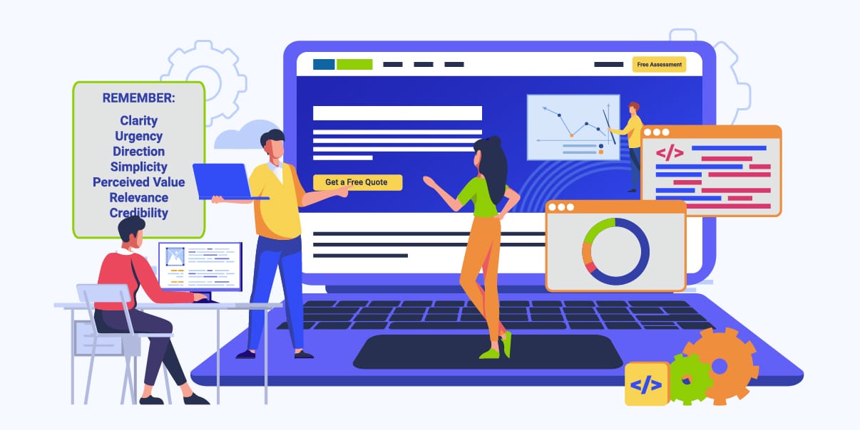
The 7 Principles of Conversion-centered Design
The 7 principles are designed to ensure that your website’s landing page meets the needs of its users while providing them with an intuitive and engaging experience. Let’s look into each in detail.
Principle 1: Clarity
The principle of clarity is essential for any successful landing page design. It involves providing visitors with clear and concise information that is presented in an organized fashion, allowing them to easily find what they are looking for. Visually, this includes using clean designs that eliminate clutter and focus on the key message or goal at hand. In terms of content, it means writing in a way that is easy to understand, using simple language and avoiding jargon.
A landing page must be clear in order to properly engage and convert visitors. A clear design is a key factor for improving user experience, as it provides visitors with a better understanding of the page, allowing them to quickly find what they are looking for. Clarity also helps visitors focus on the main message or goal of the page and encourages them to take action.
The key to attaining clarity is creating an organized and visually appealing design that eliminates any unnecessary clutter. This can be achieved by ensuring that all elements on the page are relevant and focused on the main message or goal of the landing page. Additionally, concise language should be used in order to clearly communicate the key message or goal of the page.
Principle 2: Urgency
Urgency is an important factor in converting visitors into leads or customers. It involves creating a sense of urgency among visitors by making them feel like they need to act now, or else they’ll miss out on something valuable.
Urgency helps improve conversions because it encourages visitors to take action before they lose the opportunity to do so. It also helps create a sense of trust among visitors, as it demonstrates that your business is committed to providing them with the best possible experiences and offers.
Businesses can achieve urgency on their landing pages in a variety of ways. Visually, they can employ tactics such as using countdown timers or limited availability badges to encourage visitors to act before the opportunity is gone. Language-wise, businesses should use words and phrases that create a sense of urgency and compel visitors to take action “now” or “today”.
Principle 3: Direction
Direction is key when it comes to designing a landing page. It helps visitors understand where they need to go on the page, what they should do and why they should do it.
The goal of direction is to develop a natural flow through the page, helping them find what they need to do in order to convert. It should be clear, concise and have a strong visual focus so that visitors can easily understand where they are supposed to go next.
Businesses can show direction on their landing page through a variety of ways such as visual cues, navigation menus and calls to action (CTAs). Visually, businesses should make sure that their page is laid out in an organized and intuitive way so that visitors can easily find what they are looking for. Navigation menus should be prominently placed at the top of the page, while CTAs should be placed strategically throughout the page.
Principle 4: Simplicity
Simplicity is essential for any successful landing page design. It involves creating designs that are easy to understand and use, while still delivering the key message or goal. This means eliminating clutter and focusing on the most important elements that will help visitors convert. A simple design helps improve user experience by making it easier to find what they need and encourages them to take action.
Businesses can stay simple when designing their landing page by focusing on the key message or goal of the page, and eliminating any clutter that does not contribute to that goal. Visually, businesses should use clean designs with minimalistic elements such as white space, basic colors same fonts, and simple typography. Additionally, navigation menus should be kept to a minimum and only display the most important links.
Principle 5: Perceived Value
The principle of perceived value is essential for any successful landing page design. It involves creating a top design element that helps visitors perceive the value of your product or service and encourages them to take action.
Perceived value is important because it helps create trust among visitors, as it demonstrates to them that you are offering something valuable. Additionally, when visitors perceive value, they are more likely to convert into leads or customers.
Businesses can create a visual appeal and perceived value on their landing page by focusing on the benefits of their product or service and using visuals, such as high-quality images, that demonstrate those benefits. Additionally, businesses should also focus on creating a sense of urgency by using language and visuals that make visitors feel like they need to act now or else they’ll miss out on something valuable.
Principle 6: Relevance
The principle of relevance is essential for any successful landing page design process. It involves creating a design that is relevant to the visitor’s needs and interests, as well as being tailored to their specific situation.
Relevance helps improve user experience by ensuring that visitors are presented with content that pertains to them. Additionally, it helps increase conversions, as visitors are more likely to convert when presented with content that is relevant and tailored to their needs.
Businesses can create a design that is relevant to their users by understanding their target audience and tailoring the design of their landing page accordingly. This means creating visuals, copy and CTAs that are specific to the user’s needs and interests. Additionally, businesses should also use personalization techniques such as segmentation and targeting to ensure that visitors are presented with content that is relevant to them.
Principle 7: Credibility
The principle of credibility is essential for any successful landing page design. It involves creating a design that builds trust and confidence in your business and encourages visitors to take action.
Credibility helps improve user experience by demonstrating to visitors that you are trustworthy and reliable, as well as providing them with the assurance they need to make a decision. Additionally, it helps increase conversions, as visitors are more likely to convert when they feel like they can trust the business.
Businesses should create a design that is credible by providing information such as customer reviews or testimonials and displaying security badges or certifications. Additionally, businesses should also use visuals such as logos and high-quality images to demonstrate their trustworthiness.
Conversion-centered Principles in Practice
Here are some case studies of how companies put the conversion-centered principles in practice.
Case Study 1: Unbounce
Unbounce is a company that helps people build landing pages. To increase conversions, they incorporated conversion-centered principles into their product. They used visuals and strategic copywriting to create urgency and provide guidance. Here’s how they designed their
Clarity
The landing page had a clear and concise headline that communicated the product’s value and unique selling proposition. It had visual cues that directed the user to take action, such as arrows and buttons with descriptive labels.
Urgency
Unbounce added a countdown timer to create a sense of urgency and encourage users to sign up for a free trial. They also used more persuasive design and copywriting to highlight the product’s value and encourage users to take action.
Direction
Unbounce used directional cues, such as visual indicators such as arrows and contrasting colors, to guide users towards the call-to-action button. This ensured users understood what they needed to do and how to do it.
Simplicity
The landing page was designed to be simple and easy to navigate, with no distractions or unnecessary information. This helped reduce friction and ensured that users could easily find what they were looking for.
Perceived Value
Unbounce highlighted the product’s benefits and features to show users its perceived value. The company also displayed the reviews of their previous customers to further their customer base and show the value of their product.
Relevance
Unbounce personalized the landing page for different audiences based on their needs and interests. They used data-driven insights to create messaging and visuals tailored to different user personas.
Credibility
Unbounce added social proof, such as customer testimonials and trust badges, to increase credibility and trust. This reassured visitors that the product was trustworthy and worth investing in.
As a result of these conversion-centered principles, Unbounce increased their free trial and sign up forms take-ups by 30%.
Case Study 2: Airbnb
Airbnb is a global online marketplace that connects travelers with local hosts, offering a unique and affordable accommodation experience. The company applied the principles of designing pages for conversion to improve the booking experience and increase revenue.
Clarity
Airbnb’s booking process was designed to be clear and easy to follow, with no confusing or ambiguous language. Airbnb used clear labels, visuals, and copywriting to ensure users could easily understand how the product works. The design was kept simple so there were no distractions or complications for users.
Urgency
Airbnb used scarcity tactics, such as displaying how many people were currently viewing the property, to create a sense of urgency. This encouraged users to take the desired action before someone else books the property.
Direction
Airbnb used strong call-to-action buttons and a simple, linear booking process to guide users towards completing their booking. The company used directional cues, such as arrows and contrasting colors, to guide users through the booking process. The company also created an interactive journey that was tailored based on user choices.
Simplicity
Airbnb’s booking process was designed to be simple and intuitive, with no unnecessary or complicated steps. The company also tested their product with users to ensure it was easy to use and met their expectations.
Perceived Value
Airbnb highlighted the unique and personalized experience of staying with a local host, which added to its perceived value. The company also displayed customer reviews to further show the value of their product.
Relevance
Airbnb personalized the search results and recommendations for users based on their search history and preferences. This allowed users to find a place that was tailored to their needs and interests.
Credibility
Airbnb added social proof, such as reviews and ratings from previous guests, to increase credibility and trust. This reassured users that the product was trustworthy and worth investing in.
As a result of these conversion-centered design principles, Airbnb increased their revenue by $1 billion in just six months.
Tools and Techniques for Designing Landing Pages For Conversion
Designing landing pages for conversion requires a combination of strategy and creativity. Here are some tools and techniques that businesses can use to create effective landing pages.
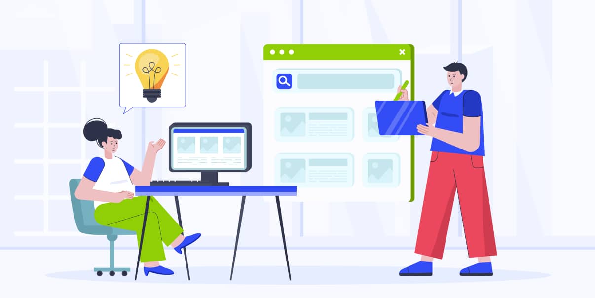
User Testing
User testing is a key component of designing landing pages for conversion. User testing involves testing the design and usability of a site or product with users to ensure that it meets their needs and expectations. It helps businesses understand how visitors interact with the page, what works and what doesn’t, and which areas need improvement. This valuable feedback can then be used to improve the design and ensure it is optimized for conversion.
Heatmaps
Heatmaps are a useful tool for understanding how visitors interact with your landing page. They provide an in-depth look at user behaviour, enabling businesses to understand which elements of their design are working and what areas need improvement. Heatmaps can help identify problems such as low click-through rates or long exit rates, allowing businesses to make the necessary changes to their design.
A/B Testing
A/B testing is a technique where businesses create two versions of a page and then test them against each other to determine which one performs better. This is a great way to identify what works best for your visitors and make improvements accordingly. A/B testing can help businesses understand user behaviour, improve conversions, and optimize their landing pages for maximum performance.
Surveys and Feedback
Surveys and feedback from users can be a valuable source of information for businesses. Surveys allow businesses to directly ask their customers what they think about the design of their landing page and get insight into how they are using it. Collecting user feedback is a great way to identify areas that need improvement, optimize the design of the page, and create a better user experience.
Usability Testing
Usability testing is another key tool for designing landing pages. It involves testing the usability of the design with real users to determine how easy it is for them to use and understand. This helps businesses identify any issues that may be preventing visitors from converting and take steps to address them.
Conversion-Centered Landing Pages and SEO
Search engine optimization (SEO) is an integral part of most landing pages. SEO involves optimizing content and websites to appear in the top search results on Google, Bing, and other search engines. It helps businesses increase their website traffic and visibility, which can ultimately lead to more conversions.
Best Practices for Incorporating SEO Into Landing Pages
When designing a landing page for conversion, businesses should also take SEO into consideration.
- Use keywords
Using keywords in titles, headings, and descriptions most landing pages can help improve visibility in search engine results.
- Optimize content for relevant keywords.
Designers should optimize content for relevant keywords to ensure that it is visible to the right people.
- Use internal links
Designers should use internal linking to create a link-building hierarchy. This helps search engines understand the structure and content of the website or app.
- Optimize images
Designers should optimize images for better visibility in search engines by adding keywords to image file names and descriptions.
- Create unique and high-quality content.
Designers should create unique and high-quality content that is relevant to the brand style target audience. This helps ensure that users are engaged with the content and more likely to take action.
- Optimize landing pages for mobile devices.
Mobile traffic is increasing continuously, so it’s important to make sure the user experience is optimized for mobile devices.
- Utilize backlinks
Designers should utilize backlinks to increase visibility in search engine results. This can be done by creating high-quality content and asking other websites to link to it.
Common Mistakes To Avoid When Designing Landing Pages For Conversion
Designing landing pages for conversion requires a combination of strategy and creativity. Here are some common mistakes to avoid when designing landing pages:
Focusing on Aesthetics Over Functionality
Designers may sometimes focus on aesthetics over functionality when creating landing pages for their conversion goals. This can lead to a design that looks good but doesn’t offer users the necessary features and functionalities to take action.
Aesthetics are important, as they create an attractive visual experience for visitors and help make other elements of the page stand out. However, it is important to remember that design elements should not take precedence over functionality.
Ignoring User Behavior Data
Designers may sometimes ignore user behavior data when creating landing pages for conversion. This can lead to a design that does not meet the needs of users or takes into account their preferences and interests. Without understanding user behavior, designers are unable to create a design that is tailored to user needs and optimized for conversion.
User behavior data such as heatmaps and click maps can provide invaluable insights into user behavior and preferences. Designers should use this data to create a design that caters to the needs of their target audience.
Overcomplicating the Design
Designers may sometimes overcomplicate the design of their landing page in an attempt to make them stand out. This can lead to a cluttered and confusing page that is difficult to navigate and understand.
Rather than adding too many elements, designers should focus on making the page simple, intuitive, and user-friendly. Simplicity is key for creating an effective design that is optimized for the conversion rate.
Failing To Test and Optimize
Designers may sometimes fail to test and optimize their design for their conversion rates. This can lead to a page that is not performing as well as it should be and failing to generate the desired results. It is important to regularly test, measure, and optimize the performance of landing pages in order to ensure they are constantly improving and reaching their full potential.
Conclusion
Conversion-centered design is an important technique for creating effective products and driving conversions. It focuses on understanding user needs, providing clarity and direction, creating urgency, offering perceived value, and ensuring relevance and credibility. By using the right tools and techniques, designers can ensure that their product meets user expectations and drives conversions.
By applying the principles of conversion-centered design, companies like Unbounce and Airbnb have seen success in increasing their conversions. By avoiding common mistakes and understanding user needs, designers can create effective products that drive more conversions.
In a world where competition is fierce, conversion-centered design offers an edge for businesses looking to stand out from the crowd. By using the right tools and understanding user needs, designers can create products that drive conversions and increase revenue.
At BIT Studios, we understand the importance of conversion-centered design and marketing strategy, including UI/UX Design Services, and are committed to helping you create effective products that drive conversions. Contact us today to learn more about how we can help you succeed. We look forward to working with you!
Related Posts
Custom WordPress Development: 10 Best Practices for Success
Website vs. Web Application: Which Is Better For Your Business?

We’re BIT Studios!
At BIT Studios we specialize in designing, building, shipping, and scaling beautiful, usable products with blazing-fast efficiency