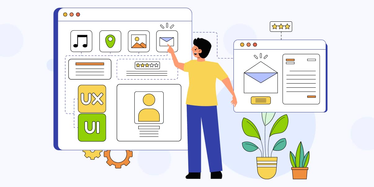
What Is User Experience Design?

A Comprehensive Guide to Crafting Exceptional Experiences
Imagine feeling happy using a new app or website because everything is fun and easy to understand. That is a good user experience!
User experience (UX) design ensures digital products are a joy to use. UX designers create products that are easy to use, visually attractive, and solve users’ needs efficiently. They use their creative powers to make sure everything is just right.
UX design is an integral part of modern digital products. It can have a positive impact on how successful they are. By creating simple-to-use products, UX designers can ensure users maximize their experience. The better the user experience, the more people will use these digital products.
This blog will discuss the importance of UX design and what it takes to create exceptional experiences. We will also cover the elements and processes involved in UX design and the role of UX designers. So, let’s dive in!
Defining User Experience Design
UX design is the art of crafting digital experiences that are intuitive, enjoyable, and engaging. It focuses on how users interact with web-based systems or products.
Moreover, UX design is a unique field where designers create enjoyable digital products, like apps, websites, and games. When you interact with these products, you will have a positive experience.
A good user experience designer also considers all aspects of the user journey when creating a product. Every element should be carefully crafted to create an enjoyable and effortless experience.
User experience designers must also keep up with the latest design trends and technologies. They adapt their designs quickly to keep up with the ever-evolving digital landscape.
The Role of UX Design in Creating User-Friendly Digital Products
UX design plays a significant role in creating user-friendly digital products. It can improve user engagement, satisfaction, and loyalty when done right.
Good UX design creates an experience focusing on the user’s needs. It understands how users interact with digital products and tailors the experience to meet their needs. By taking this approach, user experience designers can create intuitive and engaging experiences.
Also, UX design helps digital products stand out from the crowd. Designers can use their creativity and design skills in a competitive landscape to make excellent products.
Core Principles and Objectives of User Experience Design
The core principles of UX design focus on the following:
- Usability
The most crucial element of UX design is usability. It means creating a product that is accessible and responsive. Users can complete tasks quickly and effortlessly by ensuring products are easy to use.
- Accessibility
When creating a product, ensure it is accessible to everyone, regardless of ability or device. User experience designers must consider accessibility from the outset.
- User-Centeredness
UX designers must prioritize the users when creating an experience. Understand their needs and preferences to create an experience that meets their expectations.
- Efficient Design
Strive to create experiences that are efficient and streamlined. By removing unnecessary steps or features, users can complete tasks more quickly.
The Elements of User Experience Design
Below are the vital elements user experience designers use to create exceptional experiences:
1. Information Architecture (IA)
Information architecture organizes content for optimal navigation. It involves using clear hierarchy and categorization to make it simpler for users to find what they want.
Organizing and Structuring Content for Optimal Navigation
Organizing and structuring content for optimal navigation is the foundation of UX design. It includes creating a structure that lets users move through the product quickly. Plan out every element to ensure users find what they need without confusion.
The Importance of Hierarchy and Categorization
Hierarchy and categorization are essential elements of UX design. It helps users understand where they are in the product and how to move around it. Users can easily search for anything by creating a clear and logical hierarchy.
Techniques for Creating Effective Information Architecture
To create an effective information architecture, use the following techniques:
- Create clear and logical hierarchies.
- Use categorization to group related content together.
- Keep the user in mind throughout the process and make sure your design is intuitive and responsive.
- Ensure the navigation structure is easy to use and understand.
- Design for scalability so you can adapt quickly as your product grows.
- Test your design to ensure it is effective and meets user needs.
Following these techniques can create an information architecture that meets users’ expectations. These will help ensure a successful digital product.
2. Interaction Design
Interaction design is creating interactive experiences that meet user needs. It involves designing how users interact with digital products, like buttons, menus, and sliders.
Creating Intuitive and Engaging User Interactions for a Better User Experience
Interaction design focuses on creating engaging interactions so you do not have to think too hard about what to do next. Good interaction designs are buttons, menus, and other elements that work just as you expect them to. Thus, these make your experience smooth and enjoyable.
Core Principles of Interaction Design
The core principles of human-computer interaction design are as follows:
- Simple and Intuitive Design
Products should be easy to use, and interactions should be predictable. Be sure your designs are intuitive so users can complete their tasks quickly.
- Responsiveness
Designers must ensure interactions are responsive and fast. If a product is responsive, users will be more satisfied and likely to continue using it.
- Feedback
Give users information about the results of their actions, like a button changing color when you click on it.
- Flexibility
Allow users to customize their experience, like changing the font size or theme color.
Common Interaction Patterns and Best Practices
Common interaction patterns are proven ways of designing interactions that work. These include using standard UI design for specific tasks, like buttons and menus. By following these patterns, designers can ensure their products are intuitive and enjoyable.
Meanwhile, best practices help designers create cohesive and consistent experiences across digital products. These include setting design standards for a product, like color palettes and typography.
Adhering to these ensures users have an enjoyable experience with every interaction. So here are some of the best practices you should consider in UX design:
- Prioritize the user and design with their needs in mind.
- Create a clear workflow and ensure each step is intuitive.
- Use visuals, like icons, to enhance navigation and usability.
- Make sure all elements are consistent across your product.
- Test your design before releasing it to ensure it meets user needs.
- Keep your design up to date with the latest trends and technologies.
Indeed, interaction design is about making digital products feel like second nature to use. This magic touch makes using apps, websites, and games a breeze and a pleasure. And that is the reason it is essential to create remarkable digital experiences.
3. Usability
Usability is a critical part of building websites, apps, and games. It ensures that digital products work well and are accessible to users regardless of age, abilities, or experience.
Ensuring Ease of Use and Accessibility for All Users
Usability means creating a product that is easy to use and accessible to all users. By designing for usability, you can ensure users have an effortless experience with your digital products.
Vital Usability Principles and Guidelines
To ensure usability, a UX designer should adhere to the following principles:
- Clarity
Make sure all elements are clear and labeled correctly. Everything must be easy to understand and straightforward.
- Simplicity
Create simple designs. Aim for simplicity in design, as it makes products easier to use and understand.
- Consistency
Maintain consistent elements across the product. It ensures users can move around with ease.
Conducting Usability Testing and Evaluations
Usability testing is an essential part of UX design. It makes the product work as expected and meets user needs. Thus, a UX designer conducts tests with real users to obtain insights into how they interact with the product.
These evaluations can include the following:
- A/B Tests
- Usability Studies
- Surveys
- Interviews with Users
By collecting feedback from users, designers can make improvements to the product.
4. Visual Design
Visual design is the process of creating visually appealing and functional digital products. It includes color, typography, and imagery to create an aesthetic that complements usability.
Incorporating Aesthetics and Branding Into User Experience Design
Visual design plays an essential role in UX design. Incorporating aesthetics and branding elements can contribute to making your product unique. These can also create a more engaging and enjoyable experience for users.
The Role of Color, Typography, and Imagery in UX Design
Color, typography, and imagery are the three main elements of visual design. Each plays an essential role in designing visually attractive digital products.
- Colors give life to your product and provide a unique identity. They evoke emotions, create moods, and enhance usability.
- Typography helps communicate information in a visually appealing way. Choose a typography that is easy to read and fits your brand’s personality.
- Images can add visual appeal and help convey messages better than words alone. Select imagery that is relevant to your product and resonates with users.
Striking the Right Balance Between Aesthetics, Functionality, and Usability in UX Design
When creating digital products, strive to balance aesthetics, functionality, and usability. To achieve this balance, consider the following:
- Understand user needs and design with them in mind.
- Create a visually attractive design that aligns with your brand’s identity.
- Let users customize their experiences, such as changing the font size or theme color.
- Test designs to ensure they are effective and meet user needs.
- Regularly update designs with the latest trends and technologies.
By considering these tips, you can create digital products that are both beautiful and functional.
5. Content Strategy
Content strategy is the process of creating engaging and persuasive content for users. It involves curating messages that are meaningful and relevant to target audiences.
Crafting Meaningful and Relevant Content for Target Users
Content strategy is essential to create a compelling user experience design. Good content should be meaningful, relevant, and engaging for target users. It includes creating articles, videos, images, or in-app messages. The goal is to ensure users find helpful and enjoyable content.
The Role of Content in User Experience Design
Content plays a crucial role in UX design because it is what people interact with the most. Good content helps users learn new things, solve problems, and have a better overall experience. It makes a digital product stand out and keeps users returning for more. Moreover, you can use content to create an emotional connection with users.
- Here are some tips for creating meaningful and relevant content:
- Understand your user’s needs and preferences.
- Create persuasive messages that match your brand’s identity.
- Choose words carefully and use a voice that resonates with users.
- Use visuals, like videos or images, to add depth to your content.
- Keep your content current so it remains relevant for users.
- Test your content regularly to ensure it meets user needs.
Following these tips allow you to create content that resonates with users and helps them make the right decisions.
Strategies for Creating Engaging and Persuasive Content
When creating content, use techniques to ensure it is engaging and persuasive. Here are some of the strategies you can use to make your content stand out:
- Storytelling
Utilize storytelling to create an emotional connection with users. Focus on building a narrative that resonates with them and captures their attention.
- Personalization
Personalizing content helps capture users’ attention and creates a unique experience. Try to craft content tailored to users’ needs and preferences.
- Customer Focus
Put your customers at the center of your content strategy. Use customer feedback, interviews, and surveys to understand their wants and needs.
- Repetition
Use repetition to drive messages home. It will help ensure users remember your content after leaving your product.
- Visuals
Use visuals, like videos and images, to make content more engaging. Also, consider using color contrast to highlight essential elements.
Using these strategies and techniques lets you create content that relates to users and encourages them to act. Crafting meaningful and relevant content is an essential part of UX design.
The UX Design Process
The UX design process consists of critical steps to create successful digital products. By understanding these elements, you can craft meaningful user experiences.
1. UX Research and Analysis
UX research and analysis is the process of understanding user needs and behaviors. It includes analyzing competitors and conducting interviews, surveys, and observations. This step helps a UX designer understand what users want from their products.
Understanding User Needs and Behaviors
The first step in UX Research is determining what users need and how they behave. It helps designers create products that are useful and easy to use. UX designers need to understand user needs and behaviors. It involves conducting research, such as interviews, surveys, and observations. With this data, they can create products that meet users’ expectations.
Analyzing Competitors and Industry Trends
Designers also investigate other products in the market and study industry trends. It helps them understand what’s working well, what can be improved, and what users might look for in the future. It’s like scouting out the competition to ensure your product stands out.
Conducting User Interviews, Surveys, and Observations
User interviews, surveys, and observations give UX designers more insights into user behaviors. Interviews help designers understand people’s goals, frustrations, and motivations. Surveys let them gain insights into user preferences and opinions. Meanwhile, observations provide insight into how people interact with digital products in reality.
Once the UX designers have collected this data, they can create better user digital experiences.
2. Design and Prototyping
Design and prototyping involve creating an interactive experience that meets user needs. It designs how users interact with digital products.
Interaction design focuses on creating engaging interactions between users and digital products. It encompasses elements that make interactions seamless, enabling users to do tasks with ease and enjoyment.
Sketching and Wireframing
Designers create sketches of the product’s user interface (UI) and how it will look on different devices. They use wireframes to define the product’s structure and how users will navigate it.
Creating Detailed and Interactive Prototypes
Designers create detailed prototypes with accurate data to test interactions. It brings them a better idea of how an experience will work in the real world.
Gathering Feedback From Stakeholders and Users
Feedback from stakeholders and users is essential for creating better user experiences. Designers use feedback to make improvements, like updating colors and making intuitive interactions.
Overall, UX design and prototyping are crucial in creating intuitive user experiences.
3. Testing and Iteration
Testing and iteration involve refining the user experience based on feedback from tests. It lets designers analyze user feedback and identify areas for improvement.
Conducting Usability Tests and Heuristic Evaluations For User Interface Design
Usability tests are essential to ensure that designs meet user needs. Designers ask real users to try the product and see if they can do specific tasks efficiently.
Meanwhile, heuristic evaluations uncover issues and measure how users interact with digital products. They closely examine the product and compare it to a list of rules that help make sure it’s easy to use.
Analyzing User Feedback and Identifying Areas for Improvement
After doing tests, designers listen to what people say about the product. They look for things users liked, did not like, or needed help with. Feedback helps them determine what they need to change to improve the product.
Iterating on Designs and Prototypes
Designers use feedback to refine their designs and prototypes. They update color, typography, and imagery to create a better product. Also, they add or change new features to improve user experience. This process might happen a few times until the product is just right.
4. Implementation and Evaluation
This step involves launching the product and monitoring user engagement and satisfaction metrics. In addition, it continually refines and optimizes the user experience.
Collaborating With Developers for Seamless Implementation
Designers work closely with developers to make the product work. Together, they ensure the designs will turn into an authentic, functioning product that works like the prototypes. As a result, collaboration makes the process smooth and the final product the best.
Monitoring User Engagement and Satisfaction Metrics
After the product launch, designers and developers monitor how people use it. They use analytics tools to measure user engagement and analyze data. Also, they check how many people visit the website or app, how long they stay, and if they enjoy their experience. It helps them understand what works well and what needs improvement.
Continual Refinement and Optimization of the User Experience Based on User Feedback and Data
User feedback is vital for making improvements to the product. Designers use both qualitative and quantitative data to refine their designs. These data help keep users happy and engaged.
The Role of UX Designers
UX designers play an integral role in creating user-friendly digital products. They create digital experiences that ensure users have pleasant interactions. Designers collaborate with developers, UI designers, product managers, and other stakeholders.
To craft exceptional designs, each UX designer must be creative, analytical, and organized. They must understand how people interact with digital products to ensure their design is intuitive and engaging.
Also, UX designers must be up-to-date with the latest design trends, technologies, and industry standards. They must constantly research to ensure their designs are always relevant.
Critical Skills and Responsibilities of UX Designers
UX designers create user experiences that meet user needs and business objectives. To do this, they must possess the right set of UX design skills:
1. Research and Analysis
UX designers must be good researchers and understand user needs and behaviors. They need to know how users interact with digital products.
2. Design
A creative eye for design and aesthetics is a must for UX designers. They must craft intuitive designs that are visually attractive and meet user needs.
3. Prototyping
Prototyping helps designers create interactive experiences to test with users. UX designers must know how to create high-fidelity prototypes for testing and feedback.
4. Testing
Another skill that a UX designer must possess is conducting tests and analyzing user feedback. They must comprehend data from various analytics tools and identify areas for improvement. Testing lets them ensure their designs work as expected.
5. Problem-Solving
Problem-solving is a crucial skill for UX designers. They must figure out how to make a product better, faster, and more enjoyable for users.
6. Communication
Excellent communication skills are also essential in UX design. UX designers must communicate with stakeholders, developers, and team members often to ensure everyone is on the same page.
With these skills, user experience designers can create successful user experiences. They ensure the overall experience is enjoyable and engaging for users. Through their work, designers help create functional digital products that people love using.
Collaboration Between UX Designers, UI Designers, Developers, and Product Managers in Product Development
Developing a digital product is a challenging feat. It requires collaboration between different professionals with distinct roles.
These professionals collaborate during product development to create the best possible product. Also, they hold meetings to discuss ideas, share feedback, and make decisions together.
So, the collaboration between these experts is vital in ensuring websites, apps, and games are functional and easy to use. Together, they create digital products that people love.
The following experts need to collaborate in product development:
UX Designers
These team members focus on how the product feels and how easy and enjoyable it is for users. They research users’ needs, create designs and prototypes, and test them to ensure everything works well.
UI (User Interface) Designers
They work on the product’s appearance and elements, such as:
- Colors
- Buttons
- Menus
- Fonts
- Navigation
- Images
UI designers ensure everything looks excellent and matches the brand. They work with user experience designers to create a seamless and user-friendly experience.
Developers
These are the coding wizards who turn the designs into a working product. Developers write the code that makes the app or website function, ensuring it is fast, secure, and bug-free. They work closely with UX and UI designers to ensure the final product looks and works in different environments.
Product Managers
Product managers are like team captains, guiding the overall product development process. They ensure the project stays on track, the team has everything they need, and the final product meets the goals and requirements. In addition, they make sure all stakeholders have access to the data they need. Doing so helps everyone meet deadlines.
By working together, these professionals can create digital products that users love using. They ensure their product is functional and meets user needs.
Career Paths and Opportunities in User Experience Design
User experience design is a rewarding career. It offers many opportunities to learn, grow, and impact the digital world. This field is about making websites, apps, and games enjoyable and easy to use.
Having a career in UX design involves working on many projects and collaborating with other professionals. It requires knowledge, creativity, problem-solving skills, and good communication. So here are some career paths in UX design:
- UX Designers focus on the overall user experience of a product. They research user needs, create designs and prototypes, and test them to ensure they work well. UX designers play a significant role in ensuring that digital products are fun and user-friendly.
- UX Researchers love to learn about users. They use different methods, like interviews, surveys, and observations, to understand what users need and want. User research and insights help guide the design process. These make customized products according to the user’s preferences.
- Interaction Designers specialize in creating the interactive parts of a product. Interaction designers ensure that product use feels natural, engaging, and fun.
- Information Architects are about organizing and structuring the content of a product. Hence, it is easy for users to find what they want. Information architects create transparent navigation systems and layouts that make the product user-friendly.
- UX Managers or Team Leads oversee a team of UX professionals, guiding their work and ensuring everything stays on track. UX managers or team leads ensure that the team’s designs meet the project’s goals and that everyone works together effectively.
UX design is an ever-evolving field that requires continuous learning and growth. If you are creative, analytical, and passionate about digital products, then it’s the perfect career path for you! A UX design career opens up many opportunities to make a difference in digital products.
Conclusion
UX design is an exciting career that involves making intuitive user experiences for digital products. UX designers must possess the right skills to make successful products. With a career in UX design, you can create digital products that people love using and enjoy.
So, what is user experience design? UX design is creating designs and prototypes for digital products that engage users. UX designers collaborate with other professionals to create a seamless user experience.
It is about understanding your users and creating digital products that meet their needs. With user experience designers at the helm, you can create digital experiences that people love. That is the power of user experience design.
If you are looking for the best UI UX design services, count on BIT Studios. Our team of experts is highly skilled at creating user-friendly digital products tailored to your needs. Contact us today for top-notch UX designers and services!
Related Posts

A Complete Guide to Mobile App Wireframing

17 Usability Testing Tools To Improve Your UX Now


We’re BIT Studios!
At BIT Studios we specialize in designing, building, shipping, and scaling beautiful, usable products with blazing-fast efficiency